★
Overview
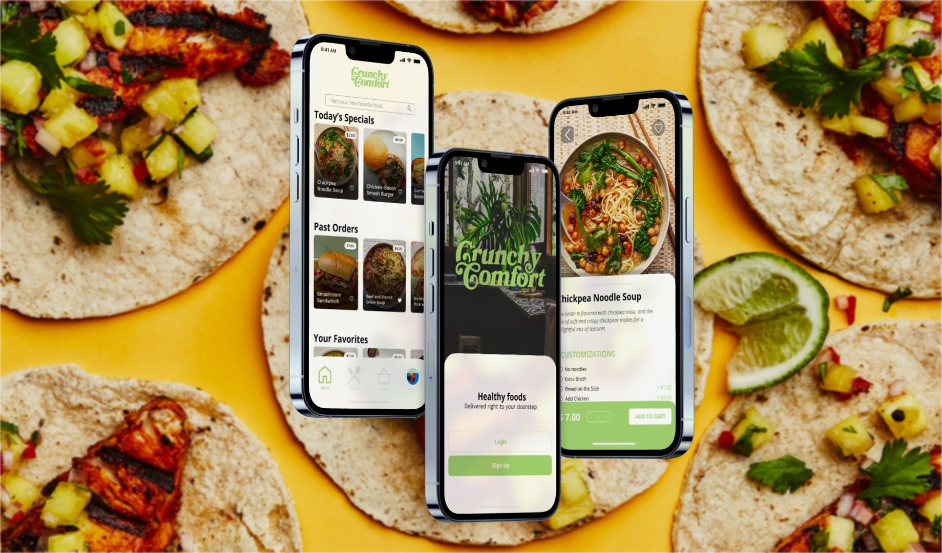
Crunchy Comfort is a fictions restaurant that aims to deliver healthy meals to their local community. Known for it’s affordable prices and inviting atmosphere, this restaurant is a favorite for either quick lunches or simple dinners. However, their customers were looking for an easier way to order their food to-go.
Role
Lead UX Designer
Timeline
october - december 2023
Tools
FIGMA, ADOBE ILLUSTRATOR, ADOBE PHOTOSHOP
Problem
Busy customers lacked a quick and easy way to order healthy meals
Goal
To create a quick and easy mobile app that will allow customers to order food from Crunchy Comfort, as well as customize the orders if needed
Research
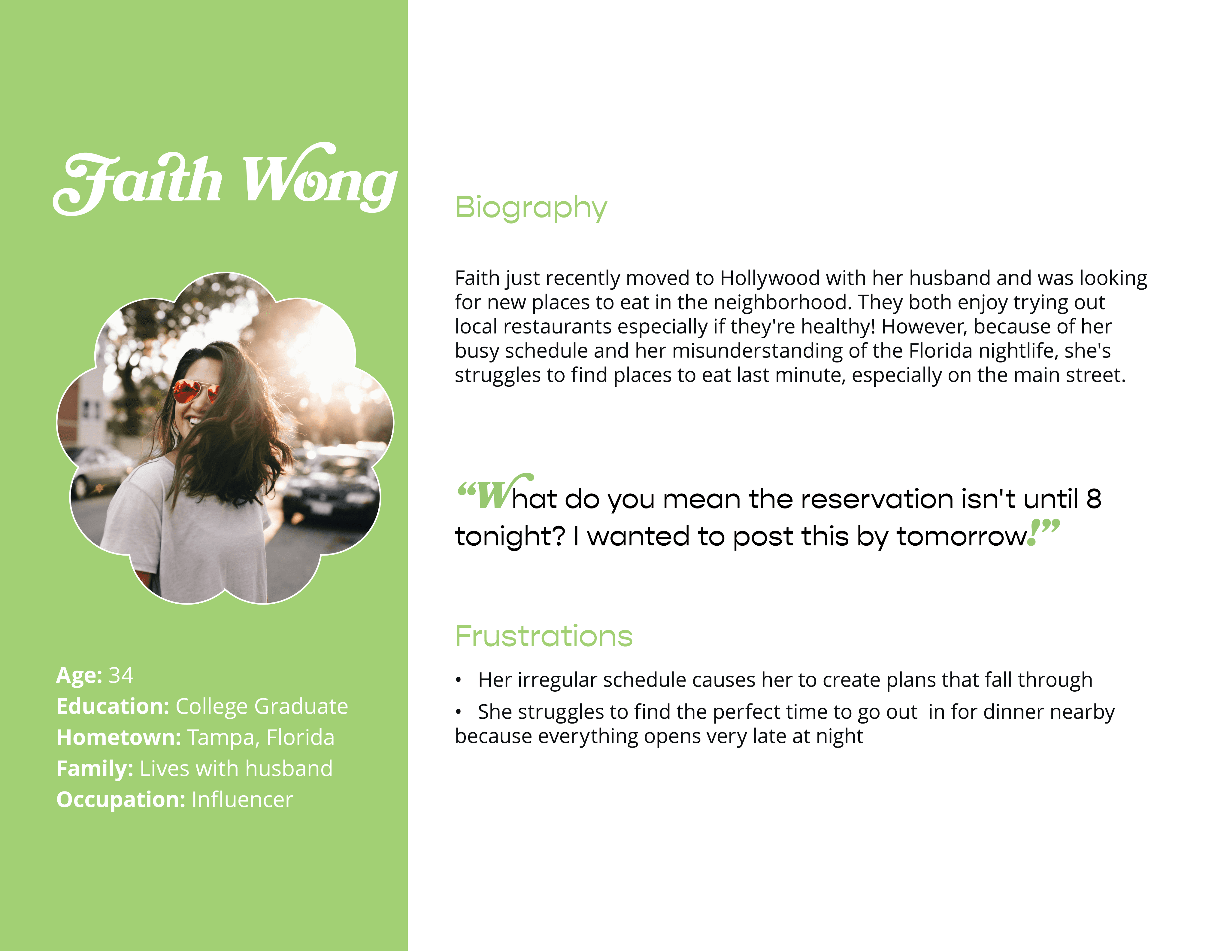
I was able to interview four people who frequently ordered their meals online, whether that was for delivery or pickup. During these interviews, I asked them questions involving the challenges they frequently face ordering from restaurants, their reasoning behind ordering in versus cooking at home. Through these interviews we found that they all lived extremely busy lives and some participants stated their unpredictable hours meant they would order meals to-go.
Findings
Working adults do not have the time to consistently be able to cook their own meals at home.
Not all platforms for ordering foods are equipped with assistive technologies.
Personas


Ideation
Conceptual Development

Homepage ideations

Interaction explorations


Design Exploration
Usability Studies
Key Findings
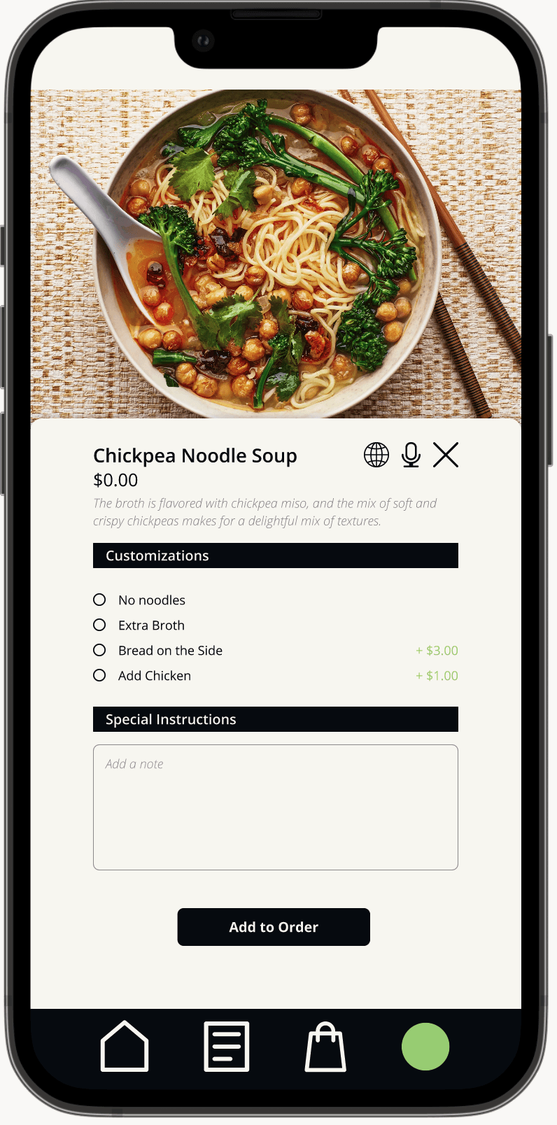
Refining the Menu
Participants 2 and 3 struggled with navigating the menu, as it was focused too heavily on the descriptions and not the price and image of the food. “This is too small to read on a phone!” one participant put it. As readability and accessibility were one of the goals of this project, it was important for users to fully understand what they were ordering as easily as possible.
Solution: Place the menu underneath the search bar for easier navigation, and create a new frame for the menu items that focused more on the image as well as the price

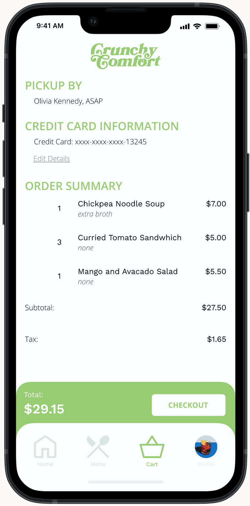
Finding a Way Back
Both Participants 1 and 2 found the check out process was too long, and they had no way to go back if there was a mistake. This is extremely disruptive towards the exit process for the user, especially if the checkout process was upwards of 4 separate pages without a way to return to the
Solution: Added accessible parking + the distinction between indoor and outdoor parking


High Fidelity Prototype
For the final iteration, I created an all-in-one website with feedback examples and a clear walk-through of the accessibility information of the Sieg Building, with updated iconography, and a fully developed design system. I iterated on the feedback provided by the usability testing. For this prototype, you are Sarah, or Boundless938, a University of Washington student who frequents the building.


Design System
Style Guide

Takeaways
If you don’t succeed... As this was my first project as a UX designer, I found myself struggling with the separation between problem solving and graphic design. I found myself reaching out frequently to others for critique and to understand the UX design process better. This project was truly a learning experience and helped me find my love for UX/UI Design.
Next Steps
I wish to continue iterating on this project, especially with it’s visual design and language. It’s current visual language feels busy for a design centered around accessibility and usability. I would also continue to develop the functionality around the map and accessibility options, adding mockups for how these options would feasibly be implemented in the final products.