

INVISIBLE HISTORIES
Vanishing Spaces
A story-led archive pilot for Invisible Histories that lets visitors discover at-risk LGBTQ spaces in the American South, explore them through decade-based guided tours, and help keep them preserved.
Role
Lead UX Designer
Timeline
7 weeks
Team
1 Researcher, 3 Designers
Tools
Figma, Figjam & Illustrator
My contributions
UX direction, guided tour UI, visual system
Launch
Jan 2026 pilot at vanishingspaces.org
(NCPTT grant support)
#story-driven-UX #information-architecture #heritage-design #LGBTQ-history #civic-tech #live-pilot
bel tee-graziose · 2024 · UW HCDE
34
✦ ✦ ✦
The problem
Where the archive went dark
Invisible Histories is a 501(c)3 community-based archive co-founded by Joshua Burford and Maigen Sullivan, PhD, to preserve the rich and diverse history of LGBTQ people, places, and events across the American South. Operating across 13 Southern states, they collect, preserve, and make history accessible so the stories of queer and trans communities are not just saved for future generations but findable, usable, and alive.
Through UW's Design for Passion program, a 9-week student-led UX sprint run by the HCDE Graduate Student Association, our team of 3 designers and 1 researcher was matched with Invisible Histories to design a pilot for their NCPTT grant: a working prototype that could prove the concept for digitally preserving physical LGBTQ spaces over the next 10 years. The content was already there. What they didn't have was a way in. Maps felt intimidating without context, and 3D tours read like dead-ends without a guided path.
(Two platform constraints shaped every decision from the start: Matterport drops users into an immersive world with no natural exit, and ArcGIS maps resist the kind of contextual layering we wanted. These weren't just technical limits. They were design problems.)
Our guiding question
How might we preserve at-risk LGBTQ spaces to display the rich cultural history of the American South?
Deliverable: a working pilot that lets community members search, see, and experience scanned spaces.
#problem-framing #civic-design #preservation #DfP-2025
bel tee-graziose · 2024 · UW HCDE
34
✦ ✦ ✦
The Product
Vanishing Spaces
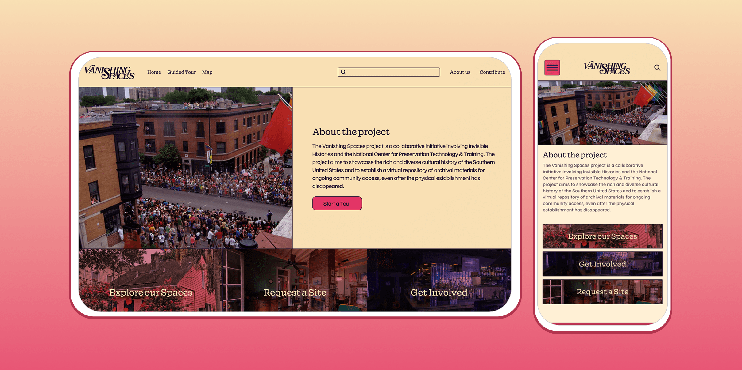
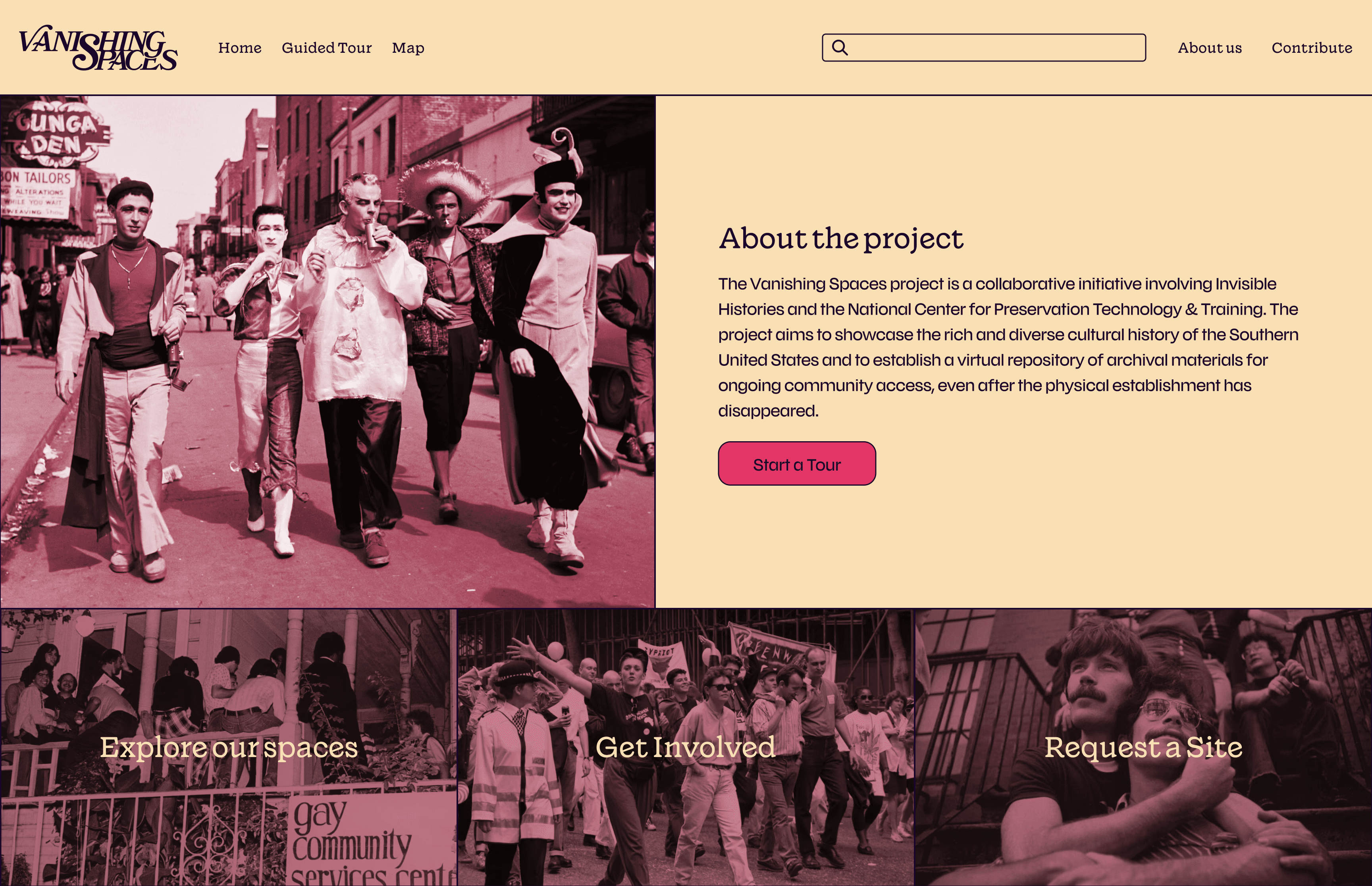
Vanishing Spaces turns at-risk LGBTQ spaces into guided, story-first experiences. Visitors can explore by decade, follow the archive through a curated tour, and help preservation feel like something worth returning to.
It all begins here
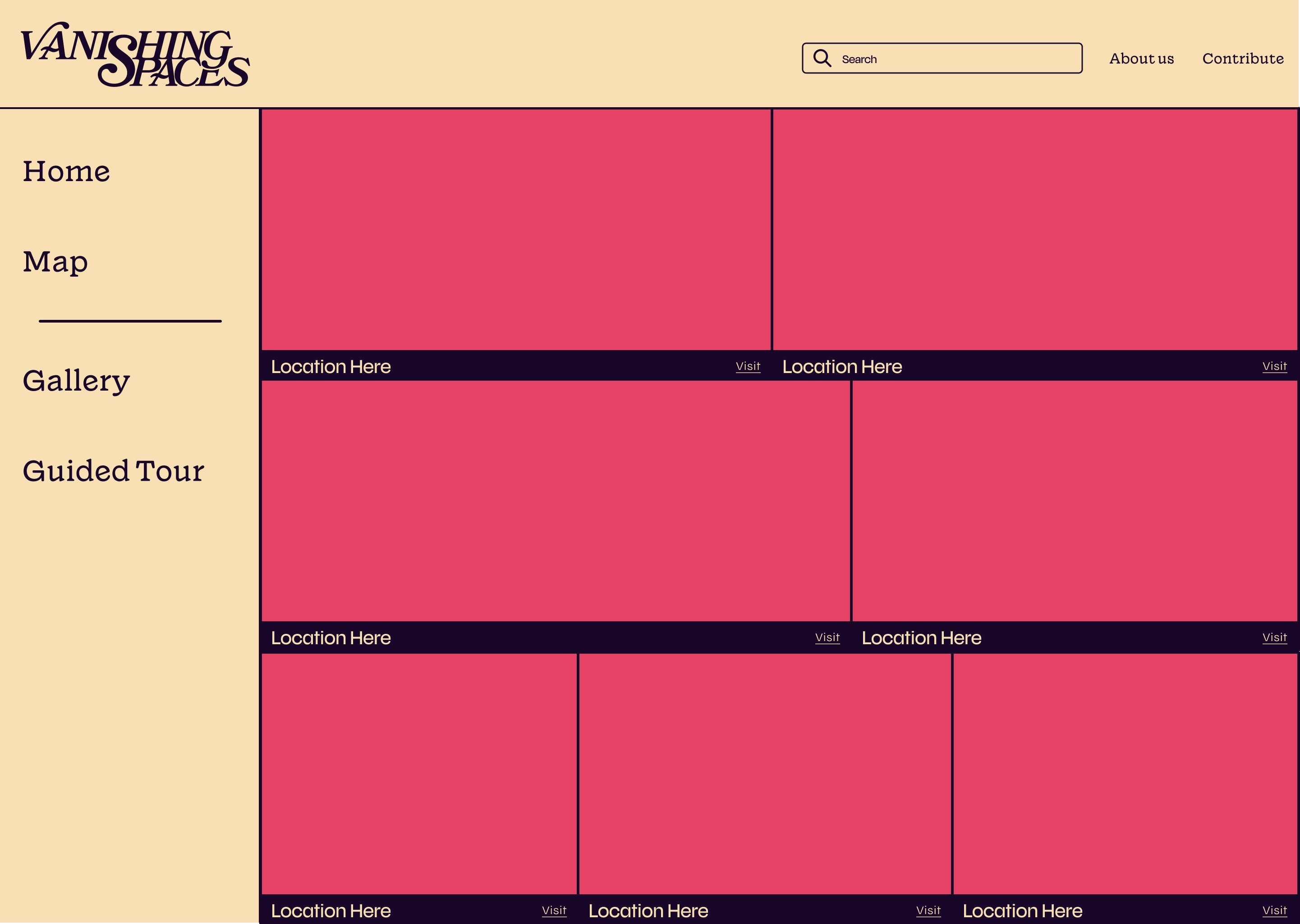
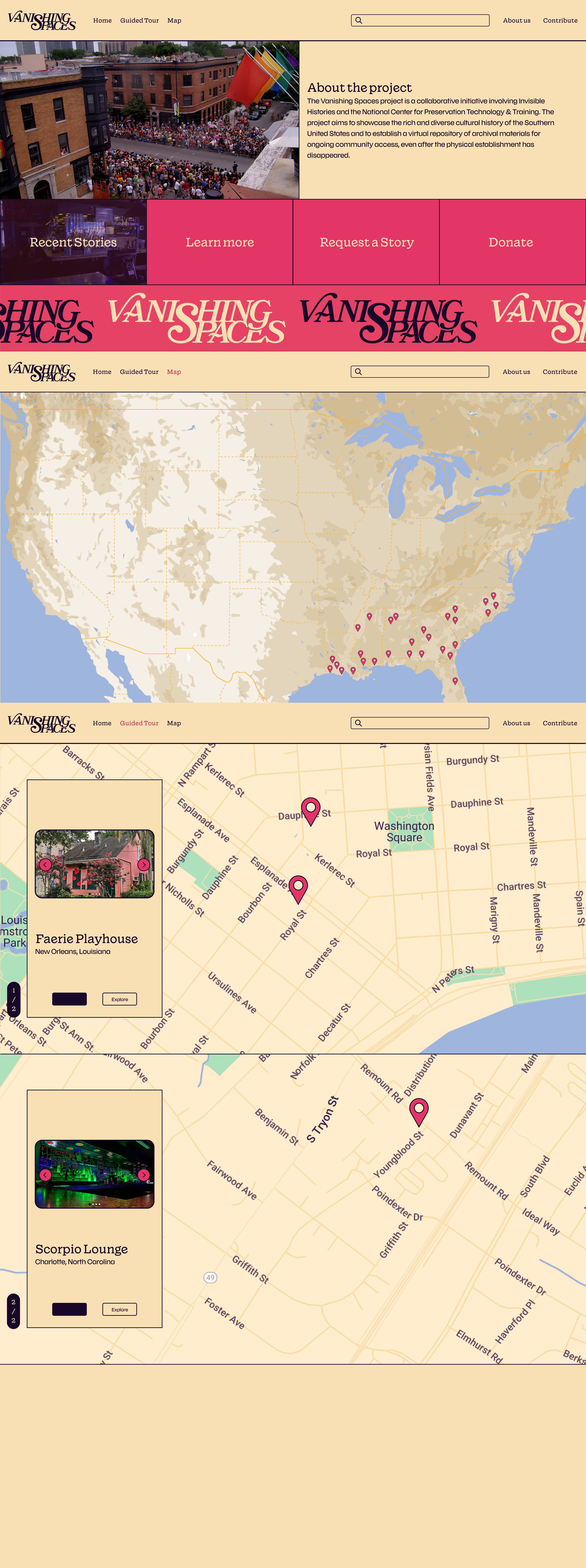
One starting point. Four clear paths: start a tour, explore spaces, get involved, or request a site.
Travel by the decade
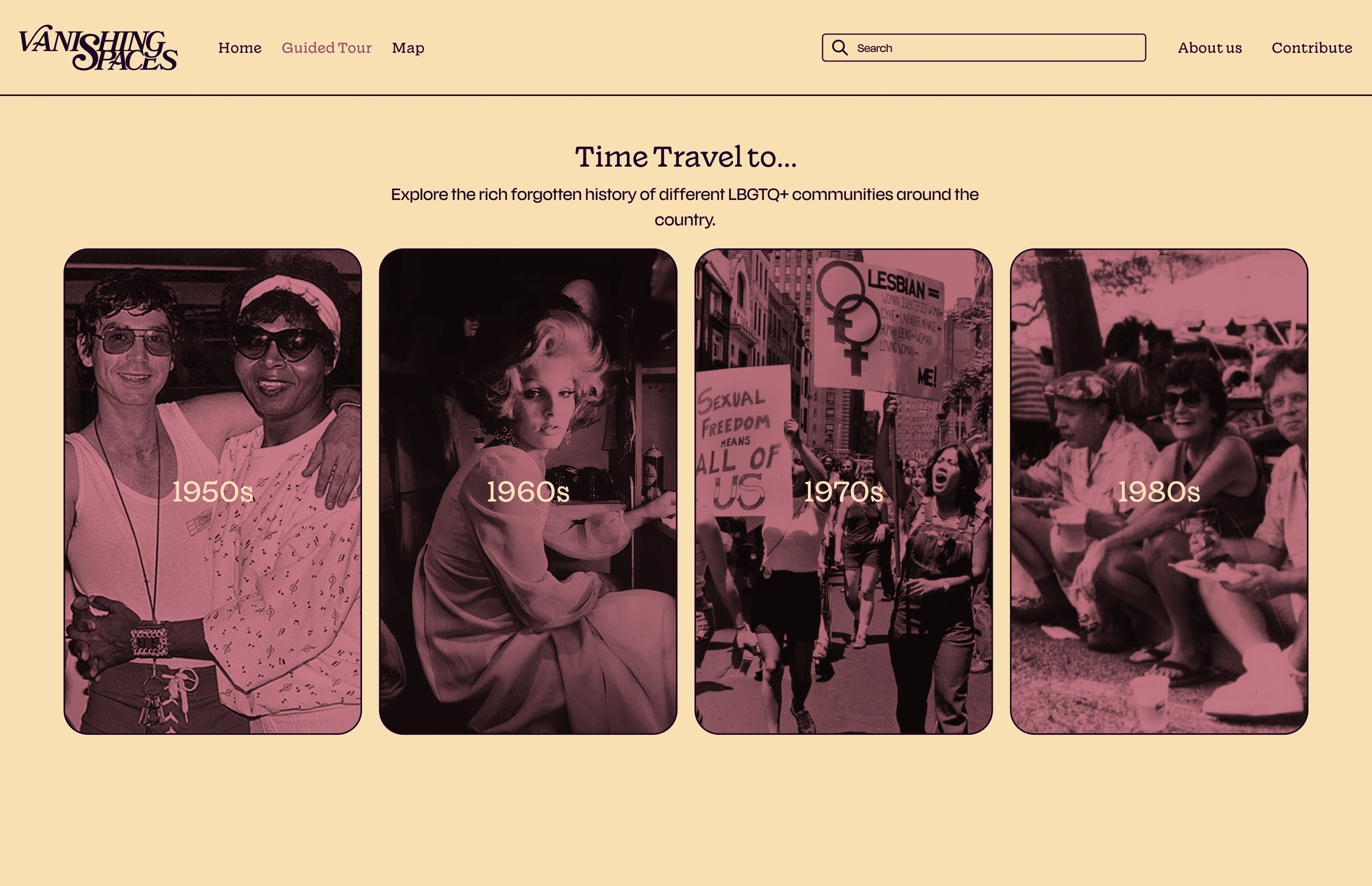
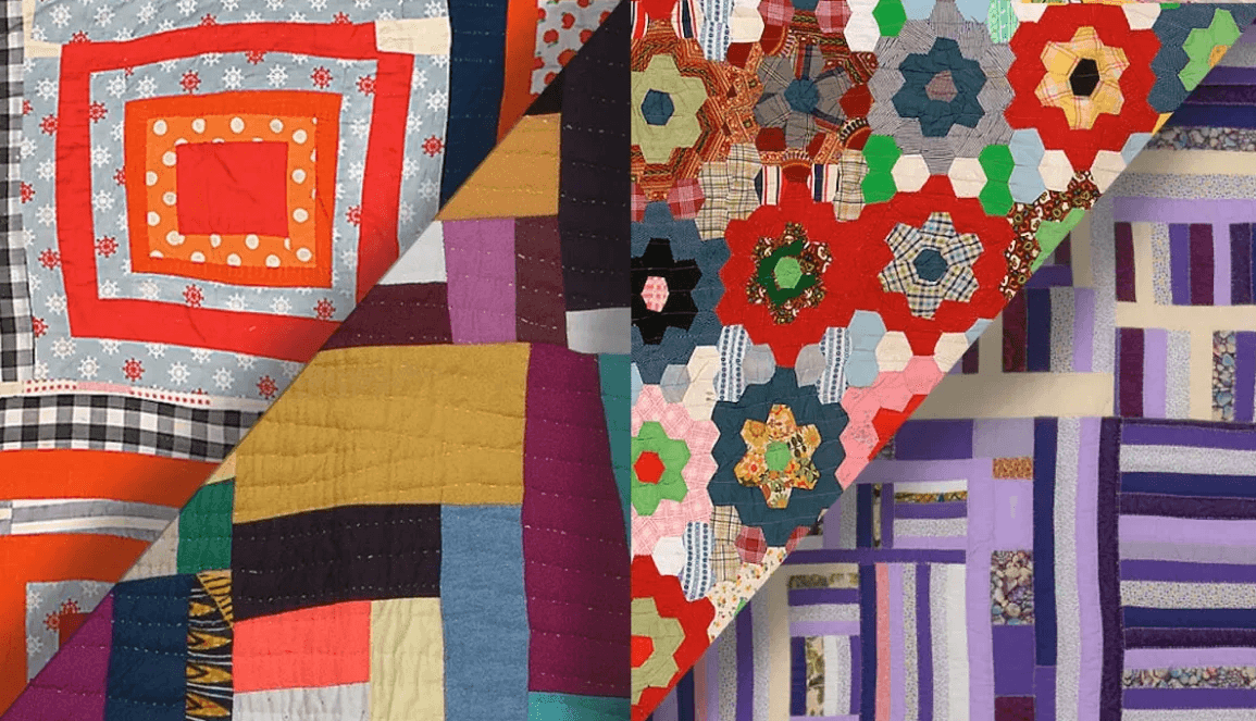
Decade-based “time travel” cards let users enter the archive through story-first exploration before maps or metadata.
Map-Based storytelling
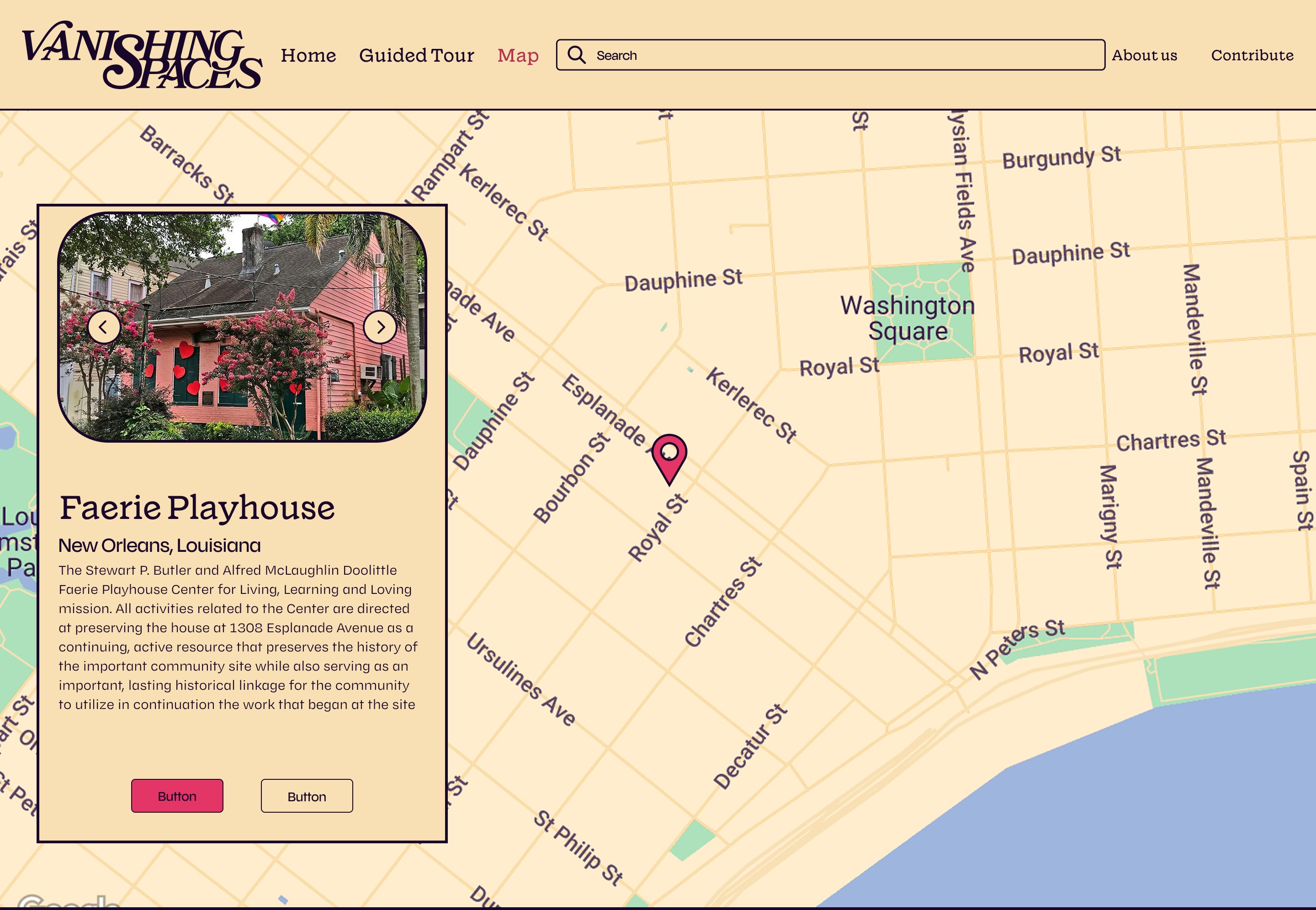
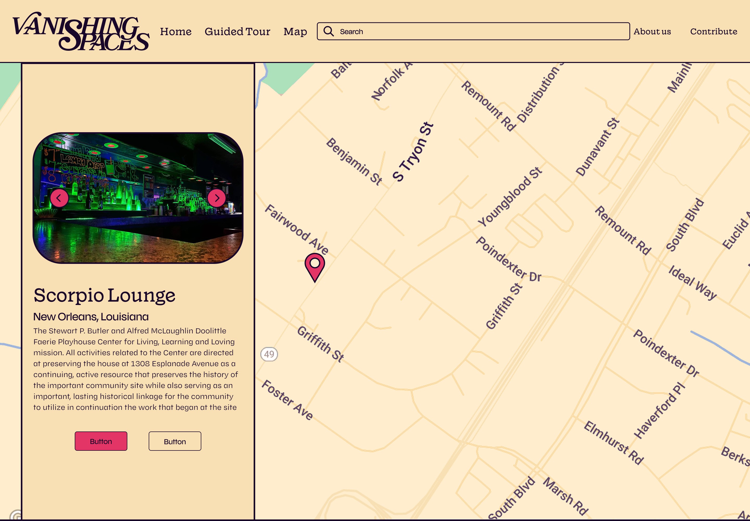
Navigation keeps the tour moving, while the story card holds place, context, and next steps close together.
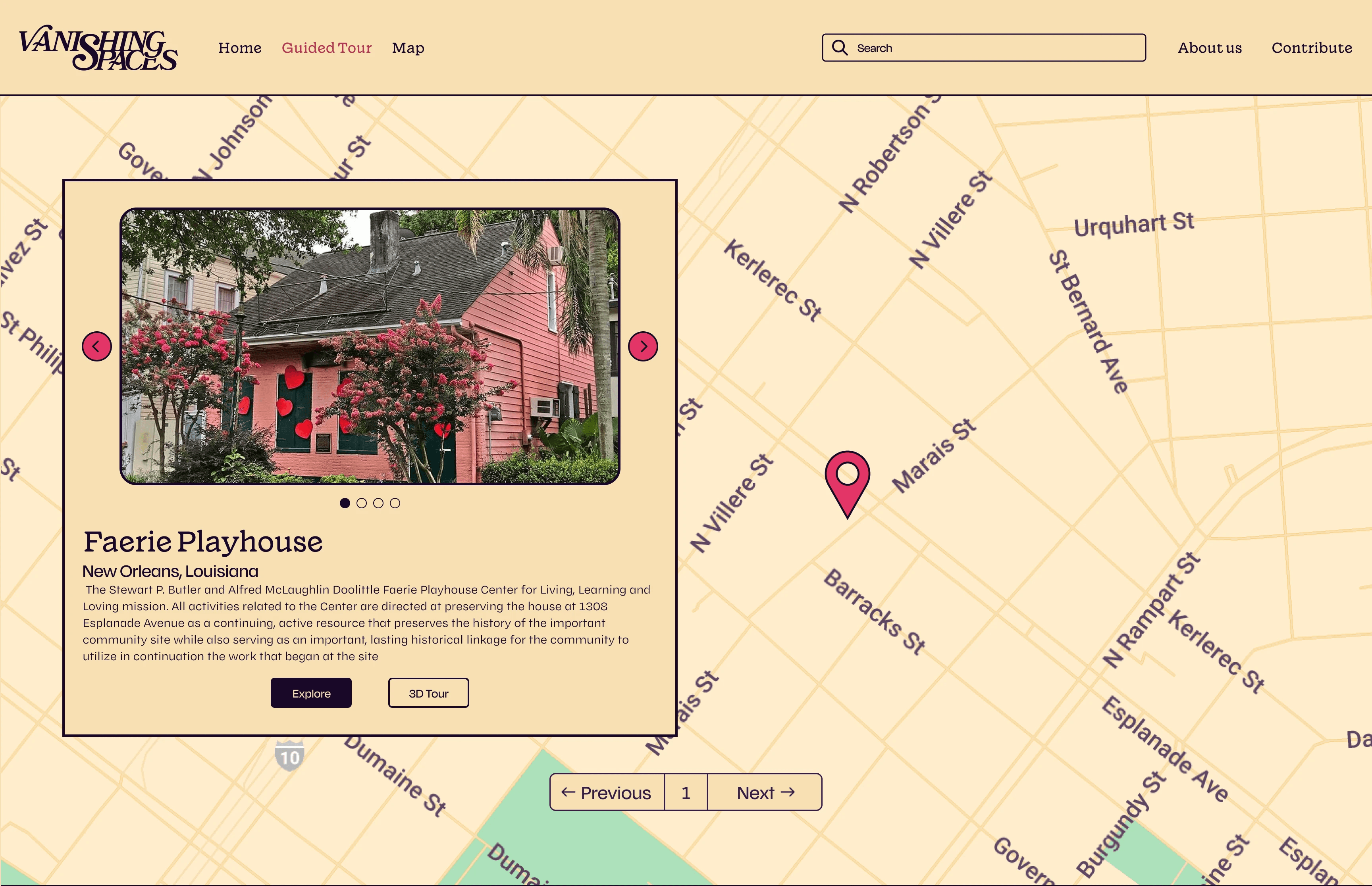
Launched January 2026 as a working pilot with two fully scanned spaces,Vanishing Spaces proved an end-to-end flow for discovering, exploring, and preserving LGBTQ spaces. It set a foundation for the archive to keep growing.
#product-design #wayfinding #civic-design #DfP-2025
bel tee-graziose · 2024 · UW HCDE
61
✦ ✦ ✦
The Research
What we learned
A tight 7-week sprint and real platform constraints (Matterport tour embeds, ArcGIS mapping behavior, limited content readiness) meant our research focused on what the grant needed to prove and the systems that would need to work alongside the prototype. Two methods gave us what we needed.
Stakeholder interviews
Talked with Invisible Histories stakeholders to define success criteria for the NCPTT grant and surface platform and content constraints.
Why: the brief came with constraints we couldn't see from the outside. We needed the people who owned the grant to tell us what success actually looked like, and what the tools would and wouldn't let us do.
Competitive analysis
Reviewed map and story archive sites to borrow navigation patterns that keep exploration oriented: clear entry points, wayfinding, and safe exits.
Why: with no users to test in a 7-week window, we borrowed from archives that had already solved the orientation problem. Learning what worked meant we didn't have to fail first.
(Matterport and ArcGIS have their own logic. Neither gives you natural exits or contextual layering. The decade cards, Previous/Next controls, and Explore links all exist because those tools wouldn't give us what we needed for free.)
Our findings
Story before structure
Visitors connect through narrative and emotional context first. Facts and metadata alone don't make history feel worth exploring.
No single path in
People want to move through the archive on their own terms, not follow a locked-in chronological sequence.
Living, not archived
The project needs to feel active and relevant to present-day LGBTQ communities, not like a museum piece.
#UX-research #stakeholder-interviews #competitive-analysis #civic-design #DfP-2025
bel tee-graziose · 2024 · UW HCDE
19
✦ ✦ ✦
The Personas
The people we kept in mind
Jordan and Sam represent two different ways into the archive. One drawn in by story and personal connection, one looking for a structured path to research and explore.
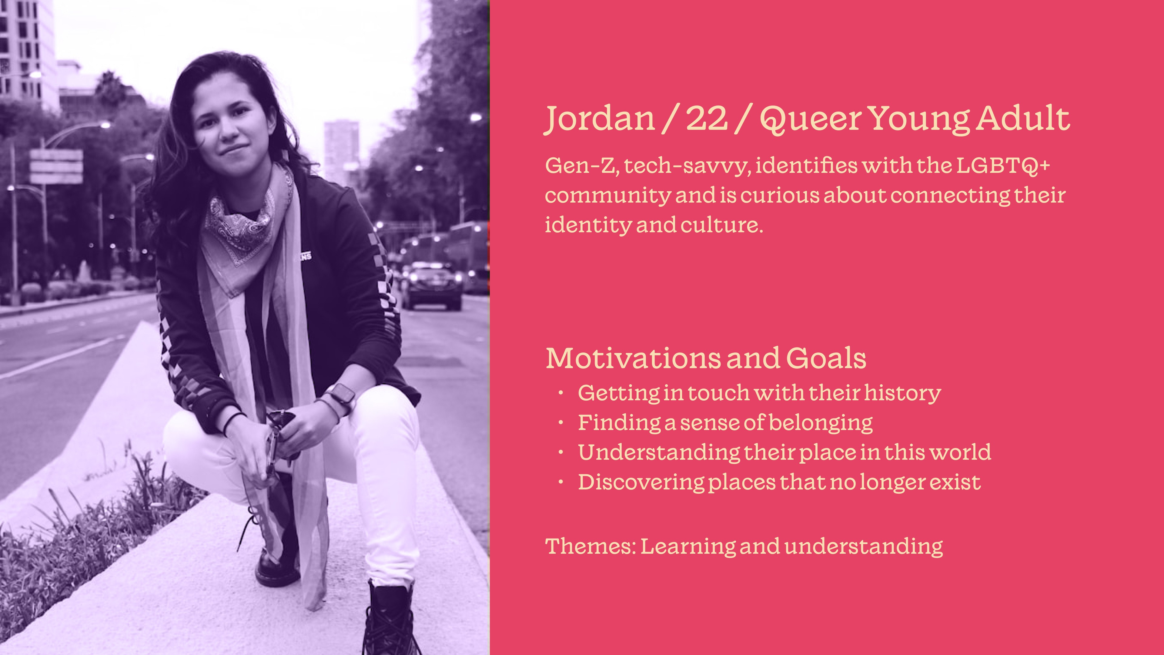
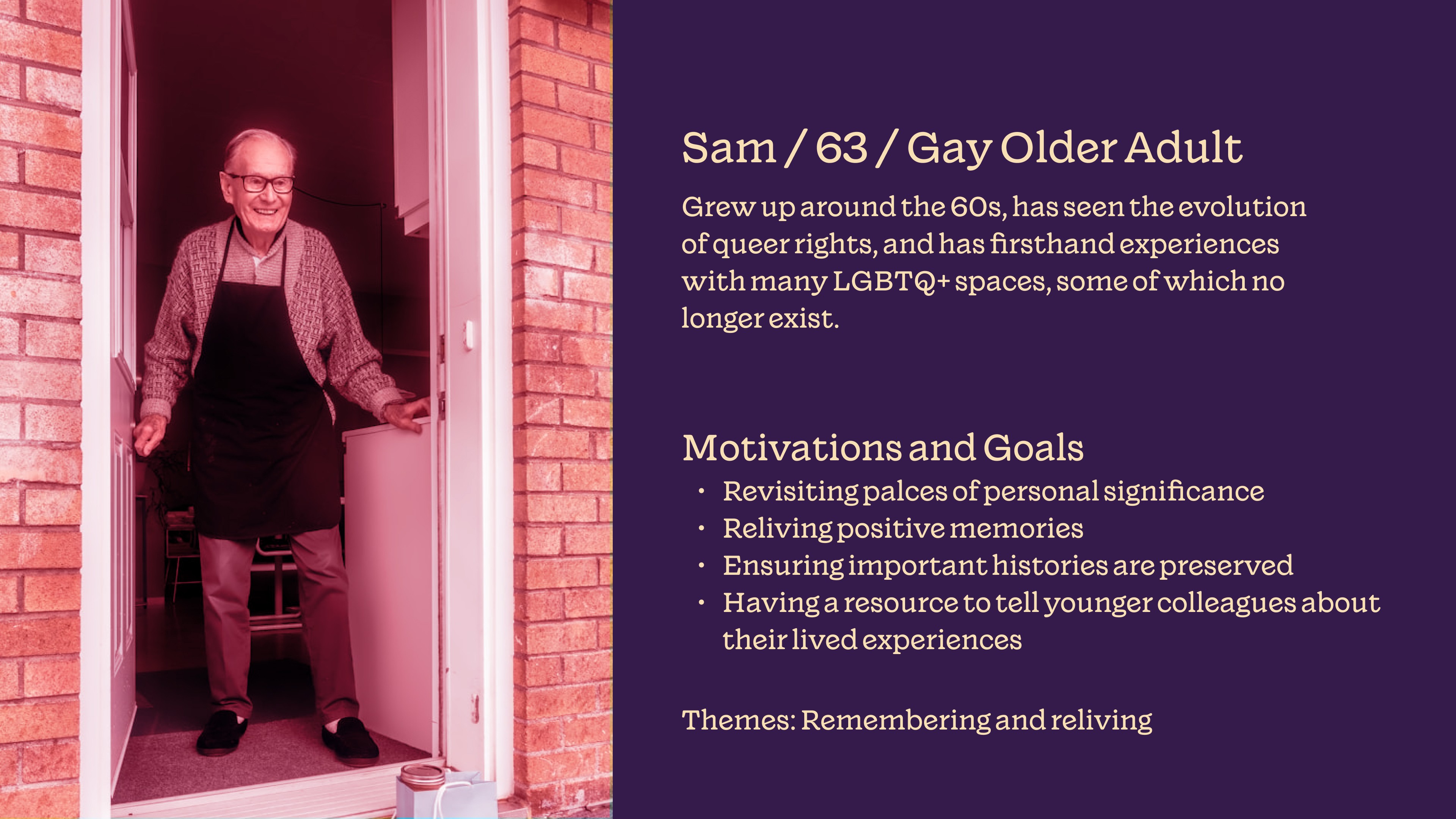
Designing for both meant keeping the guided entry human enough for discovery while giving researchers enough structure to move through the archive without digging for context.
#personas #user-research #civic-design #DfP-2025
bel tee-graziose · 2024 · UW HCDE
15
✦ ✦ ✦
The Design
Design moves
We led with story instead of dropping visitors into a map. From there, we built a guided tour with clear branching moments so people could explore without getting lost.
Proof moment: Story-first entry + wayfinding + safe exits
Archive experiences typically start map-first or go scroll-only, and our platform split (ArcGIS + Matterport) made both worse. We combined the strongest patterns from competitive research into one flow: decade cards as the default starting mode, Previous/Next and map context for wayfinding, and Explore links as safe exits. The 3D tour becomes a guided step, not a dead-end.
Decision receipts
Mode-based entry points
Map-first navigation felt like "where do I click?" in early drafts. We switched to decade cards as the default and offered the map as a secondary path for branching.
Safe exits
Scroll-led story pages can become a one-way tunnel. We added consistent "keep moving" options (Previous/Next + Explore links) into every story card and kept map context always visible.

(An early navigation sketch from week 2. I got lucky and figured out ArcGIS allowed embeds to solve our first constraint.)
#interaction-design #wayfinding #navigation-design #DfP-2025
bel tee-graziose · 2024 · UW HCDE
27
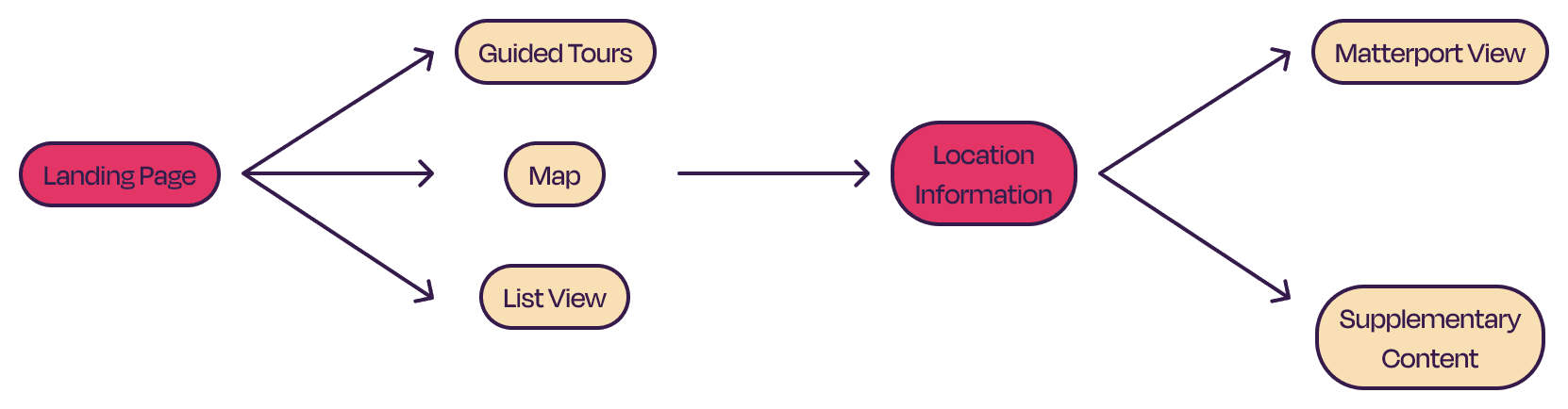
Site architecture
The diagram maps how guided tour, map discovery, and individual story pages connect into one flow. Our researcher built it from the team's early layout concepts. It became the alignment tool that kept our three main paths from fragmenting.
✦ ✦ ✦
The Prototype
✦ ✦ ✦
The Reflection
What I learned
Vanishing Spaces was my first project where the constraints came from the platform, not the users. Matterport and ArcGIS have their own logic, and learning to design around them instead of against them pushed me to think about where story could do the work that the tools couldn't. It sharpened how I design for emotion and navigation at the same time: keeping story intact while giving people freedom to explore.
I also mentored a newer designer throughout the sprint, someone outside our department who was finding their footing. That experience shaped how I think about design leadership: not just owning decisions, but helping others understand why they exist.
(If I did it again: run usability tests on the branching moments before launch: can people enter through a decade and stay oriented as they go? Document platform constraints on day one. Build a content template so the archive can scale without fragmenting.)
If you want to see where it landed, here’s the live pilot: vanishingspaces.org